
Strategies GTM
Robinhood’s Strategies product launched with a comprehensive Go-To-Market campaign that spanned across dotcom, in-app experiences, and multi-phase social campaigns. I led motion design and art direction on social campaigns across these surfaces from execution to handoff meetings, ensuring consistency and polish throughout the product launch journey.
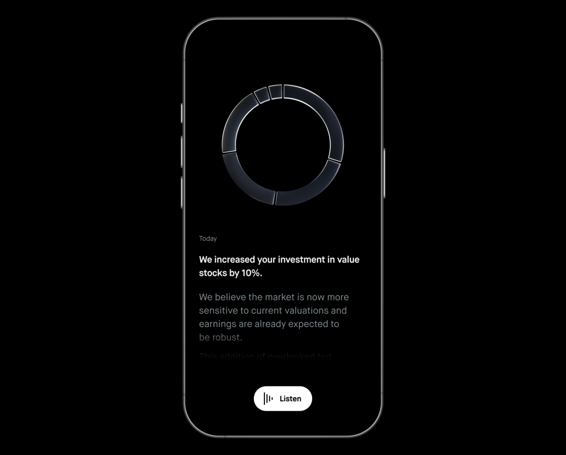
¹ In-App Product Screens
I collaborated closely with product designers and engineers to bring in-app experiences to life, including upsell screens, insight flows (portfolio increases or decreases), and onboarding moments. I created motion assets tailored to each user touchpoint and led handoff meetings to ensure seamless implementation with the engineering team. In cases of technical issues, I partnered directly with engineers to troubleshoot and refine execution.
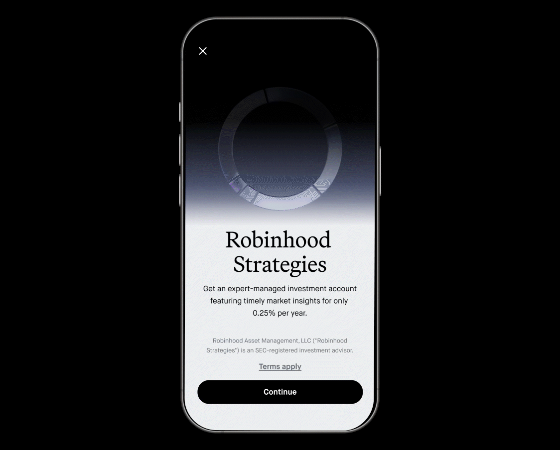

Below is a breakdown of how each asset was handed off. For the background gradient specifically, I made sure the animation extended seamlessly across the screen without visual cutoffs—preventing any resizing issues on different phone sizes.

² Social Phase 01
Teaser & Launch Announcement
Phase 01 consisted of four deliverables: three teaser posts leading up to the Gold Event and one launch-day announcement. The teasers were intentionally abstract, designed to build intrigue and anticipation without revealing the product too early.
These teaser posts gave me the most creative freedom. The direction was to be non-literal relying on visual storytelling to build brand equity around the new product. I focused on introducing core visual elements like the signature portfolio ring and its distinctive purple brand color, gradually revealing them throughout the teaser series.


The teaser visuals used Gold Event branding to tie directly into the launch moment. To align the portfolio rings with this theme, I incorporated subtle yellow hues into the glass shader—adding warmth and creating a visual bridge between the product identity and the Gold brand palette. This helped ensure the teaser content felt cohesive with the larger campaign narrative.


Teaser #01
Teaser #02
Teaser #03
For the announcement post, I animated key product UX flows to showcase core features and reinforce the product’s value in a clear and engaging way.
³ HPTO
To cap off the launch, we brought Strategies front and center on the main Robinhood.com homepage. The creative direction focused on elevating product benefits with an overview of product flows.
Below is a behind-the-scenes look at how the full composition came together—from modeling and animation in Cinema 4D, to refinement and compositing in After Effects, and finally implementation as webM assets on our homepage.
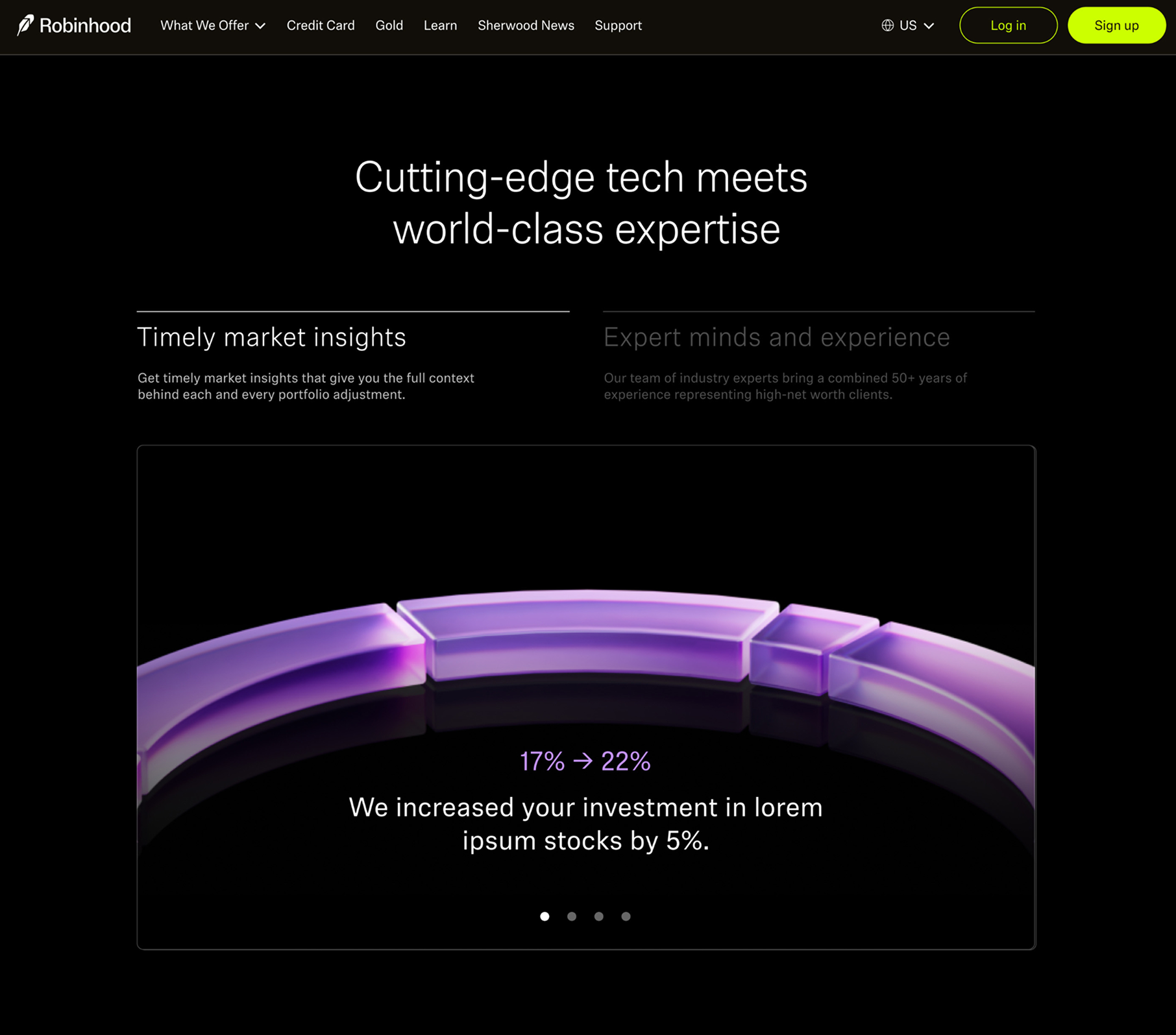
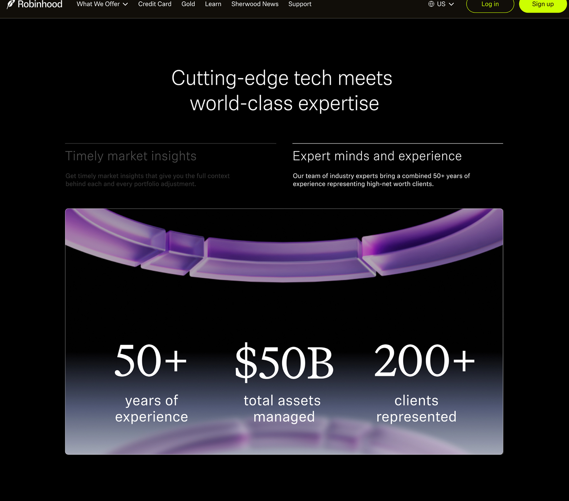
⁴ Product Landing Page
For the Strategies product page, I focused on building brand equity around the core visual motif: the purple pie chart.
My role on this project went beyond standard asset handoff; I actively directed the visual quality of the page, ensuring that the motion and design worked in tandem to support the product narrative. I worked in a tight loop with the engineering team to translate these motion-heavy designs into the final web surface, maintaining a high bar for craft and performance throughout the launch.
Product Page Overview
The main task was to build out a new product page for Robinhood Strategies to give a clear and compelling overview of the product to increase the engagement with this new release. There should be a clear hierarchy of product benefits and its value props so the users can easily understand how smooth portfolio management would be with Robinhood Strategies.
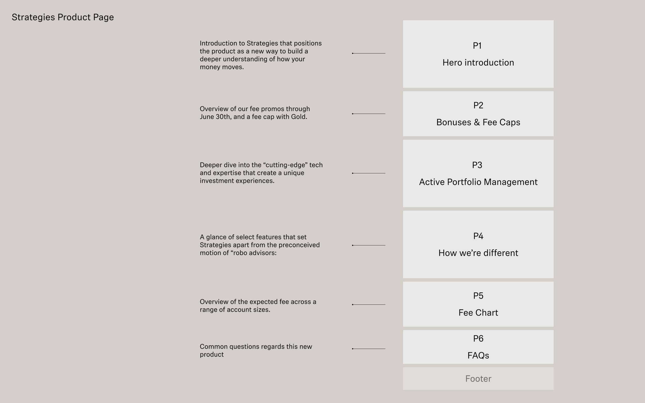
Simplifying complexity through interactive column
To differentiate Robinhood Strategies from standard robo-advisors, we needed a moment that felt more "human" and expert-driven. I designed a toggle-view experience that allows users to switch between two core pillars of the product: our timely market insights and the human experts who curate them. This interactive approach turns "heavy" information into a digestible, branded upsell moment.
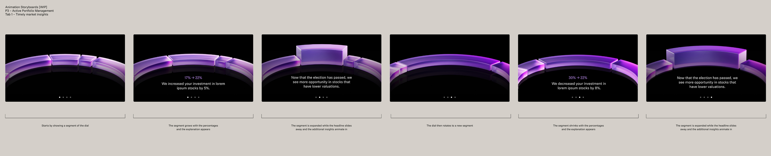
These below are the storyboards for the toggle-view experience. The first storyboard is the initial state of the page, and the second storyboard is the state after the user has toggled the view.
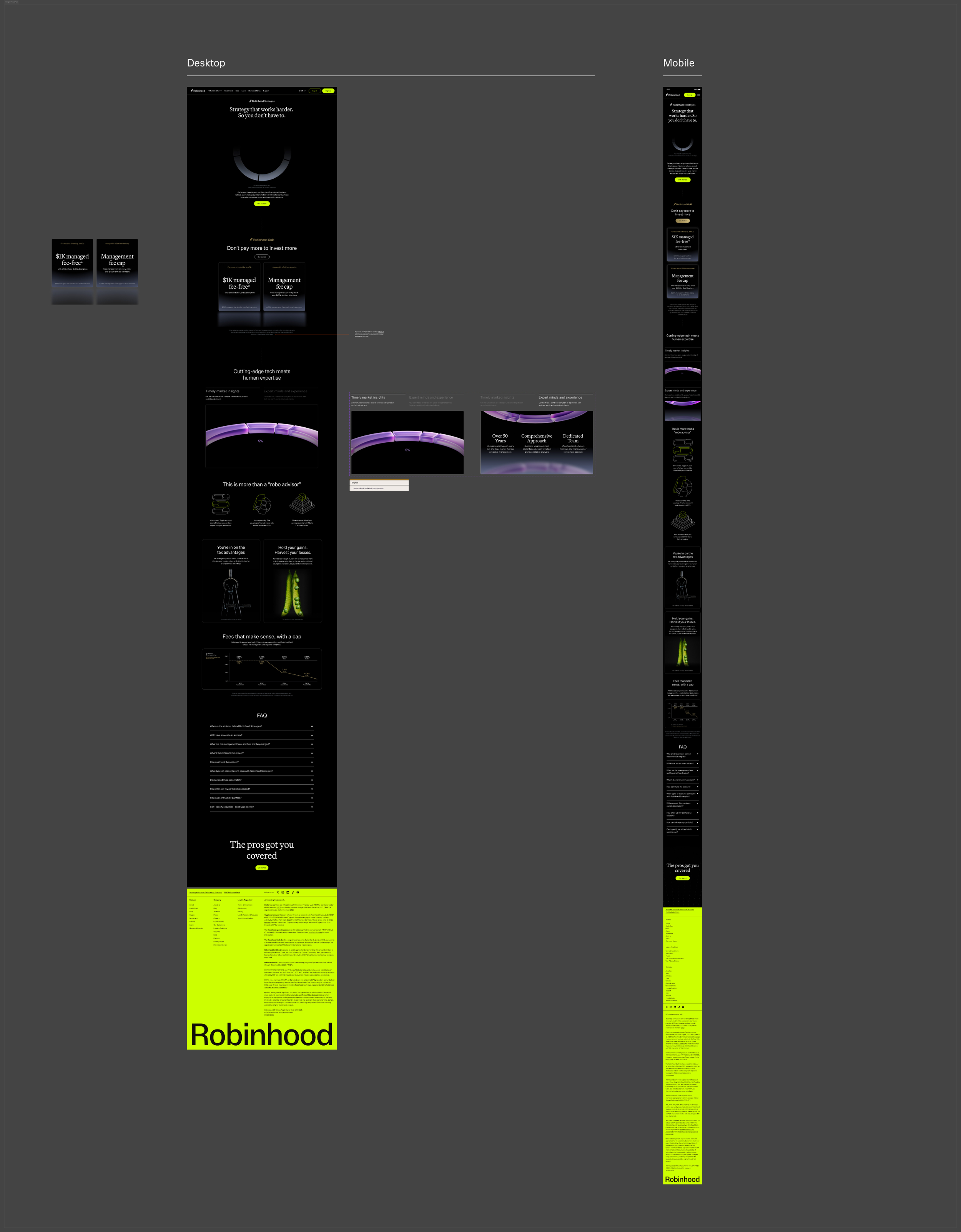
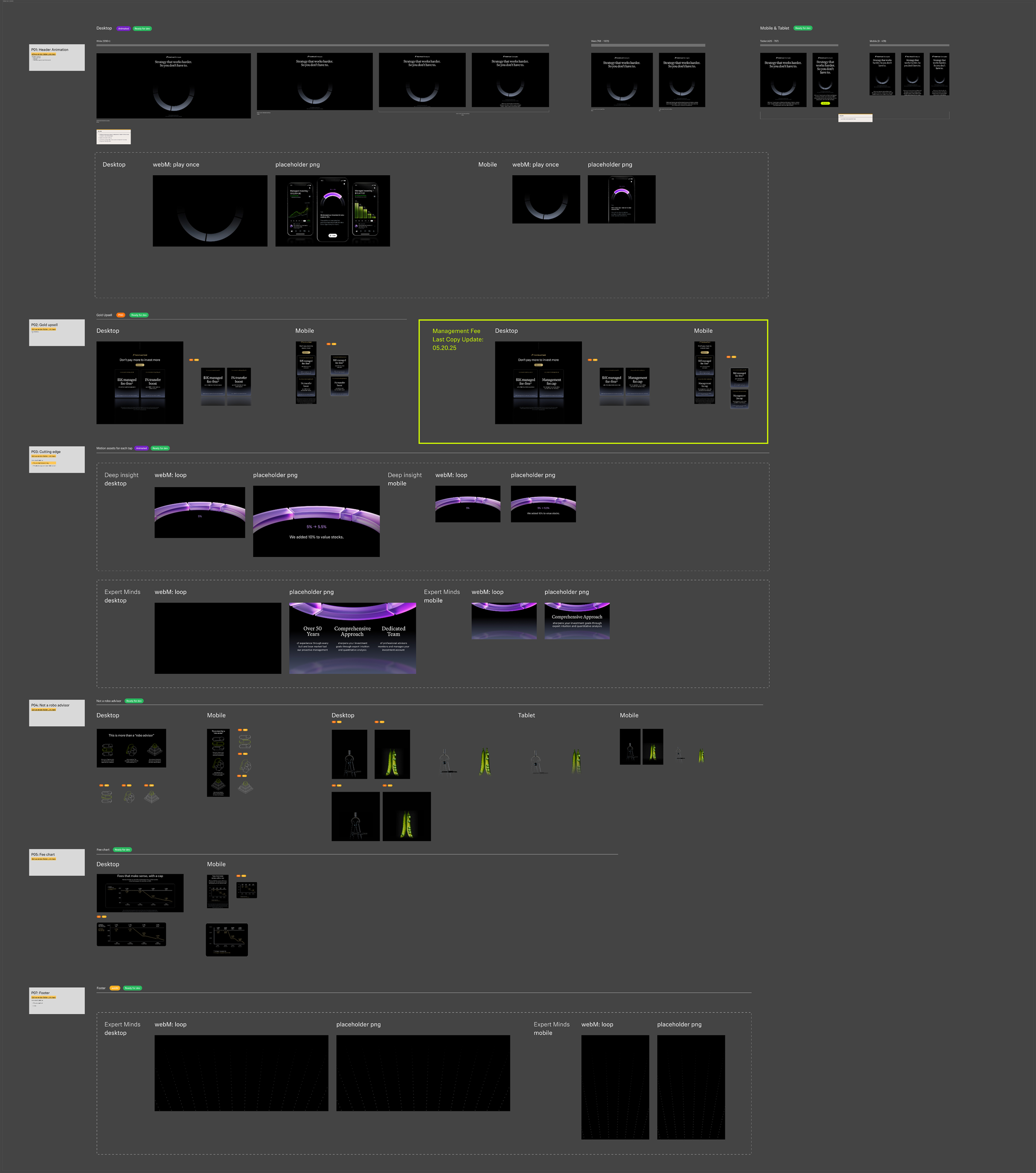
Technical Handoff & Documentation
To ensure a frictionless build, below is a comprehensive handoff system I built in Figma. This includes side-by-side desktop and mobile layout references, alongside a serialized library of every motion asset required for the page. By providing a clear visual overview of the responsive behavior and asset mapping, I helped the engineering team maintain pixel-perfect accuracy from the first sprint to the final deploy.
⁵ Social Phase 02
Post Launch Reinforcements
Following the product launch, we created a second wave of social content focused on reinforcing Robinhood Strategies’ key market differentiators. This phase consisted of three posts, each spotlighting a unique product benefit.
I led the overall design direction to ensure visual consistency across the series, while also making sure the product UI remained current and accurate as the product evolved. Each asset balanced bold motion with clear storytelling, helping to strengthen the product’s positioning and relevance in the market.
01. Not Just a Robo-Advisor
The first post emphasized how Robinhood Strategies goes beyond traditional robo-advisors. Unlike other automated solutions, it combines algorithmic guidance with real-time insights from industry experts—offering a more dynamic and personalized investing experience.
02. Fees That Work for You
This post focused on Robinhood’s transparent and customer-first pricing model. While many advisory services rely on complex or hidden fee structures, Robinhood Strategies stands out by offering simple, flat pricing—designed to be accessible and aligned with customer goals.
03. Take Control of Your Portfolio
Unlike traditional robo-advisors, Robinhood Strategies gives customers meaningful control over their portfolios. While the product provides automated guidance, users can personalize their investment strategy based on their financial goals and individual preferences.