Between Hours

¹ Why

Designed for in-between moments

A quiet journaling experience designed for in-between moments, where motion guides without interrupting.

While commuting in New York, I often wrote fragmented thoughts on my phone. They were disconnected, unstructured, and difficult to revisit in any meaningful way. I wanted a space that could hold those moments more intentionally while gently helping me notice patterns in how I think.

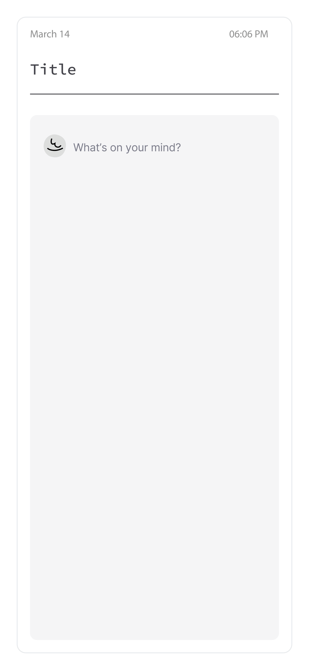
I built this as a personal tool to explore how motion can support interaction in a minimal, reflective product.

² Design direction

I intentionally avoided building an “intelligent” or overly analytical journaling tool.
The goal was not to interpret thoughts, but to gently surface patterns without disrupting the act of writing.

This led to two design constraints:

  • Writing must remain uninterrupted and primary

  • Motion should guide attention, not compete with it

Motion in this app serves three roles:

  1. Guidance — drawing attention to key actions without labels

  2. Feedback — confirming user actions subtly

  3. Tone — reinforcing a calm, reflective experience

³ Distributed motion system

Add-icon Animations

Rpeating-words-icon Animations

Reflection-icon Animations

Reflection is a low-motivation task.

Unlike writing, which is immediate and expressive, reflection requires pause and effort, making it easy to skip.

Top-words-icon Animations

Instead of relying on a single animated character, I explored a distributed system of small, purposeful motion cues across the interface.

Each icon carries a single responsibility:

  • Add button → invites exploration through motion rather than instruction

  • Writing icon → mimics analog journaling, reinforcing the act of writing

  • Analysis icon → surfaces repeated language patterns

  • Reflection star → rewards completion with a subtle state transition

  • Top words icon → guide to bring awareness to what the top 5 words are

This approach reduces cognitive load while maintaining engagement.

Adding a background image is a secondary feature and should not compete with the primary journaling flow.

The motion is designed to signal interactivity without introducing visual noise. I explored three variations with different levels of emphasis, focusing on how each influenced attention within the screen hierarchy.

I selected the most restrained option, where motion acts as a subtle affordance rather than a visual focal point. This ensures the feature remains discoverable while preserving the calm, writing-first environment.

Motion became the primary tool for this. Instead of remaining static, the reflection icon supports two key states:

  • Thinking: a subtle, continuous rotation while the user is reflecting

The thinking state mirrors the internal process of reflection. By gently visualizing this state, the interface reinforces focus without demanding attention.

  • Completed: a short transition into a filled state once reflection is done

The completed state acts as a quiet acknowledgment. Rather than a celebratory animation, the motion is brief and controlled, providing immediate feedback.

On the technical side, all states are unified within a single Lottie file and treated as a state machine rather than separate assets.

  • Idle (incomplete) — frozen initial frame (gray star)

  • Thinking — subtle loop during reflection

  • Completed — animation plays once, then rests on the final frame (yellow star)

A lightning icon is used to signal emphasis and draw attention to this summary moment within the experience.

Option 01 has more animated, bouncy interactions, but these feel overly expressive for the context. Option 02 is more fitting as it is controlled and creates a sense of prominence while maintaining a calm tone.

A pencil icon is used for the writing area to reinforce the familiarity of analog journaling in this digital space.

Motion guides attention toward the input field, inviting the user to write. Out of these three explorations, Option 03 creates the most focus to the journaling area. It also has a deliberately brief exit, which does not interfere with the flow of writing.

Write-icon Animations

A book icon represents the repeated words feature, referencing a dictionary and the idea of examining language.

The motion is intentionally subtle, with a light page-turn interaction that draws attention without interrupting the journaling flow. It acts as a quiet signal that insight is available.

This provides immediate, lightweight feedback after writing, making the experience feel more engaging.

⁴ UI Motion System

Duration Tokens

Tokens, Timing, and Behavior

A unified motion system designed to ensure consistency, clarity, and accessibility across all transitions.

  • Motion is driven by tokens, not ad-hoc values

  • Easing + duration are paired into presets

  • The system scales across screens, overlays, and micro-interactions

For interactions and interfaces, these were the main durations set for this app.

  • micro: 100ms. Native rendering buffer — never user-visible

  • fast: 200ms. Small UI transitions (toggles, popups)

  • standard: 300ms. Screen transitions

  • slow: 500ms. Large surface reveals (wasn’t used, but kept it as a part of the system )

Easing Tokens

These four easings were built to be used depending on the context throughout the app.

Default for the general state transitions

Expand for pop ups and entering with energy

Decel for entering or settling to rest

Accel for exit or accelerating away